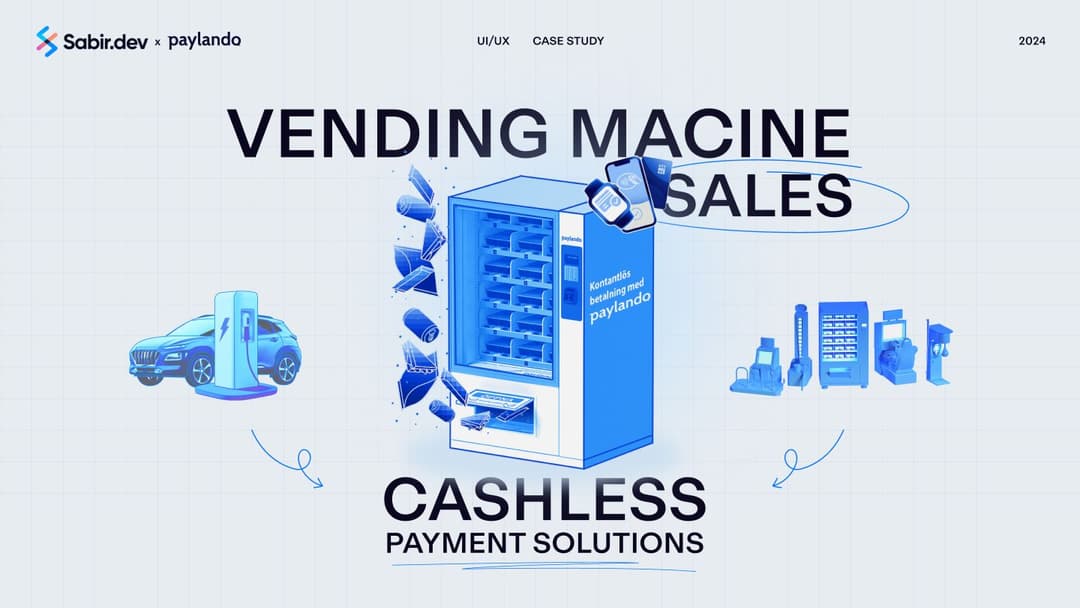
Redesigning a Cashless Payment Solution Website for Seamless Conversions
Website Redesign
Headless Website Development
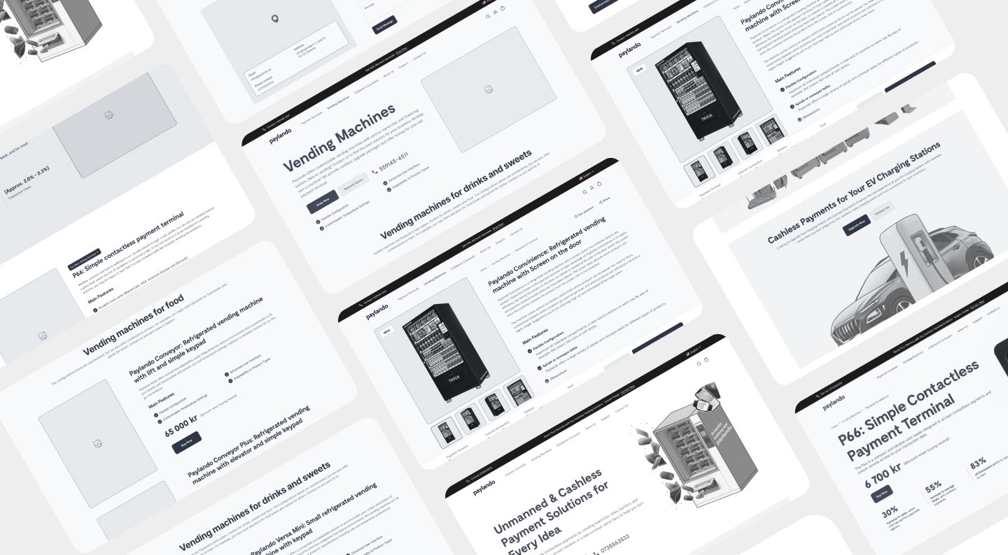
Paylando, a leading provider of unmanned and cashless payment solutions, approached us to overhaul their website, which was complex, non-responsive, and slow. Their goal was to convert more visitors into customers by creating a smooth, user-friendly experience that reflected their brand’s commitment to simplicity, security, and efficiency. We redesigned https://paylando.se/en using cutting-edge technologies and a user experience strategy inspired by industry leaders like apple.com, resulting in a clean, breezy, and highly effective multilingual website that drives engagement and conversions across global markets.
Website: https://paylando.se/en
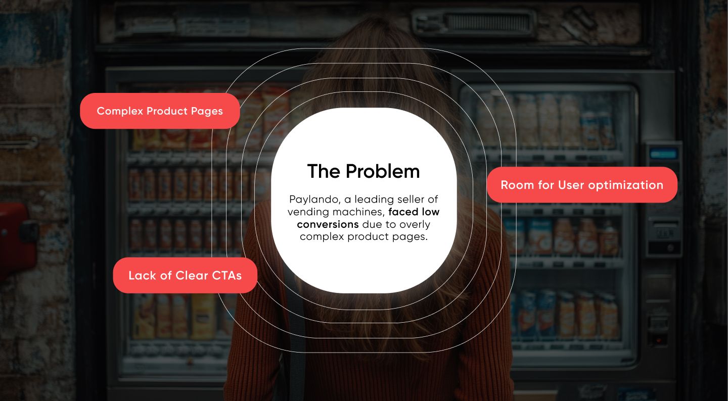
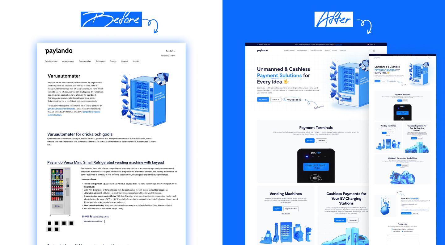
Paylando’s previous website was hindering their business growth despite attracting visitors. The key issues included:
The old website was difficult to navigate, with a cluttered layout and poor mobile responsiveness, alienating users on different devices.
Slow loading times frustrated visitors and increased bounce rates, making it hard to retain potential customers.
While the website attracted visitors, it failed to convert them into orders due to a lack of clear calls-to-action, confusing navigation, and a cumbersome checkout process (even though it was just a form submission).
The design and functionality didn’t align with modern standards, failing to inspire trust or showcase Paylando’s innovative payment solutions effectively.
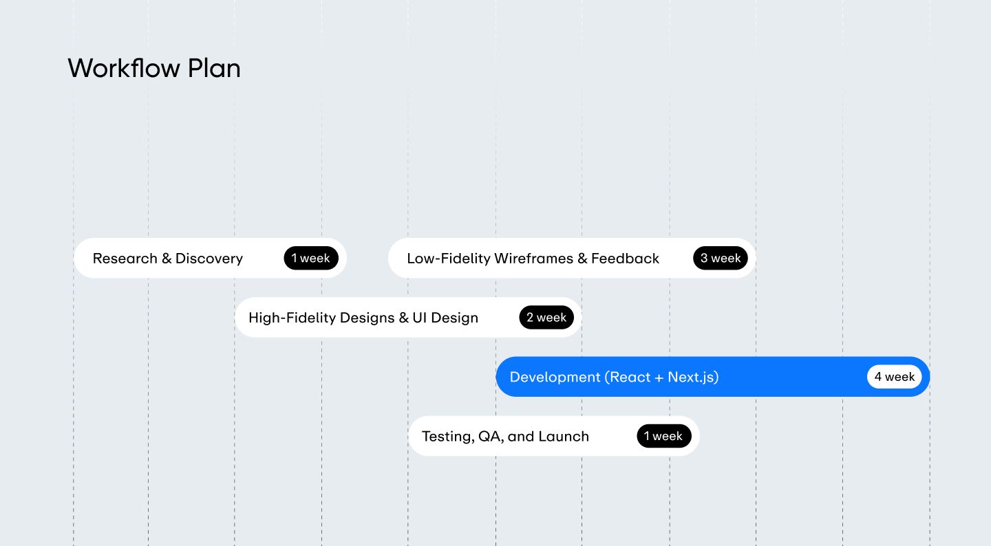
We carefully redesigned Paylando’s website, focusing on their customers’ needs and behaviors, and applied a framework and user experience (UX) strategy inspired by apple.com’s minimalist, intuitive design. Our approach included:

We conducted research to understand Paylando’s global audience (e.g., vending machine operators, parking facility managers) and redesigned the website to prioritize clarity, simplicity, and accessibility. The new design is clean, aesthetic, and responsive across all devices.

We built the website using Next.js, leveraging server-side rendering and static generation for blazing-fast load times and optimal SEO, addressing the previous site’s slowness.

We implemented Sanity.io as a flexible, headless CMS to manage content dynamically, supporting multilingual content updates seamlessly across languages.

We integrated a robust language selection feature, allowing users to switch between languages effortlessly, enhancing accessibility for Paylando’s international clients.

We used HeroUI for a modern, component-based design system and TypeScript for type safety, ensuring a stable, scalable, and maintainable codebase.

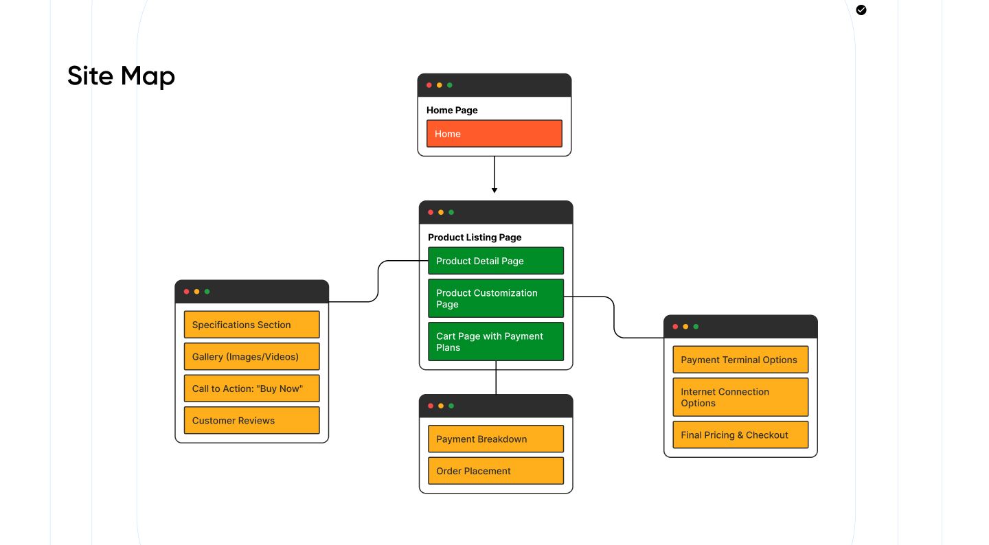
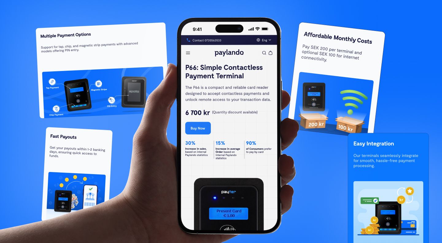
Although the final action is simply filling out a form, we optimized the process with clear guidance, minimal fields, and a smooth user flow, making it as effortless as possible for users to reach out or place an order, with multilingual form fields where needed.

We drew inspiration from apple.com’s clean aesthetics and intuitive navigation, creating a “breezing experience” that feels luxurious yet functional, with a focus on visual hierarchy, whitespace, and strong calls-to-action.
Enhanced User Experience
Faster Load Times
Higher Conversion Rates
Broader Global Reach
“Our partnership with sabir.dev completely transformed our online presence. Our previous website was a barrier to growth, but sabir.dev delivered a clean, intuitive, and multilingual solution that has dramatically improved our user experience and conversion rates. The impact on our global reach has been phenomenal. The apple.com inspired design and the technical expertise they brought to the table were exactly what we needed. We are now able to serve our diverse customer base with ease, and the results speak for themselves.”

Paylando
CEO Paylando